

Touchscreen tablet controller for Lifesize meeting rooms
The purpose of the Lifesize Room Controller App (RCA) is to work in tandem with (or in place of) the Lifesize Phone HD device. For those non-techy readers, these devices are used to control a room system that is used to make video conferencing calls. It can run on any tablet and at most tablet sizes. This allows for flexibility for the user in choosing their equipment.
Company: Lifesize
Year: 2019
Length of Project: 8-12 months
Collaboration: multiple engineering teams, 2 product managers, executive staff
Some research
UX/UI Design
Prototyping
User Testing
Executive presentation
Prototyping
Your time is important, and this page is long. Feel free to jump ahead.
Before the Room Controller App (RCA), we had designed another app that worked very similarly. Because, initally, we had very little time to design, we decided to piggyback off of the existing app and add all the new functionality we needed for the new app. Everything would pull from the same codebase, but based on the intended use, a user would only see the features relevant to how they were using the product. The old product was called Lifesize Dash. Shown below are a few screens from Lifesize Dash. This is part of the bring-your-own device kit that Lifesize rolled out in 2019.


Keep in mind, this app is only the controller for a large display where the video is shown as well as notifications and states for the call. Here are a few screens illustrating what the user would see on the display.
The features that needed to be added to the Dash app to make the RCA have parity with Phone HD were:
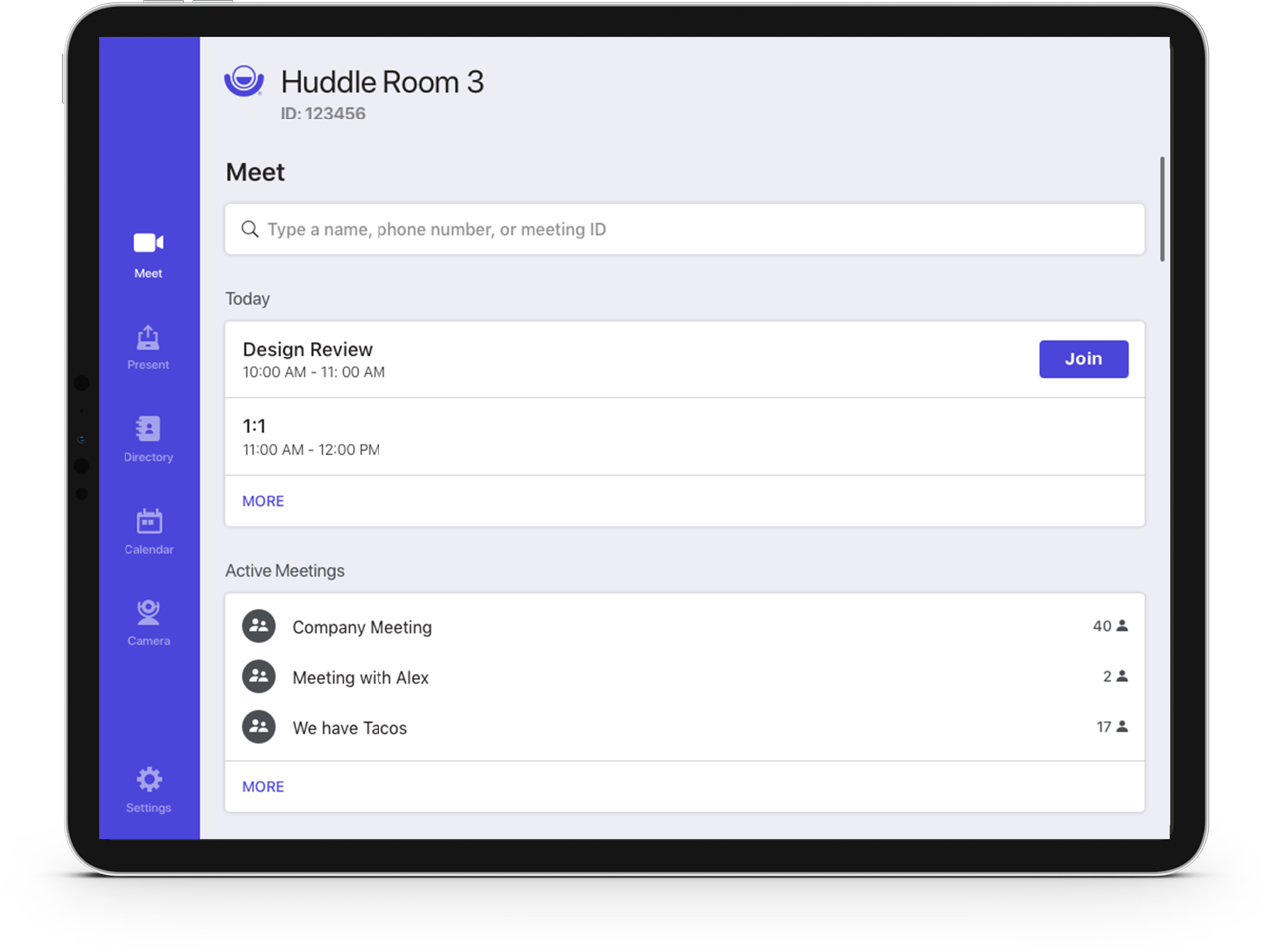
Maintain Dash’s easy way to start a call and present a screen on the home screen
Show the next upcoming meeting on the home screen or show that the room was available
Show the agenda for the room for the next 48 hours, potentially on the home screen
Show a “just in time” notification for when a meeting was about to start with an easy way to join
Have a way for a user to join a meeting if they dismissed the notification
Have a way to put the system to “sleep”
Camera Pan/Tilt/Zoom and camera presents for the room system camera
Naming a camera preset
Call a phone number (something custom that isn’t in the directory)
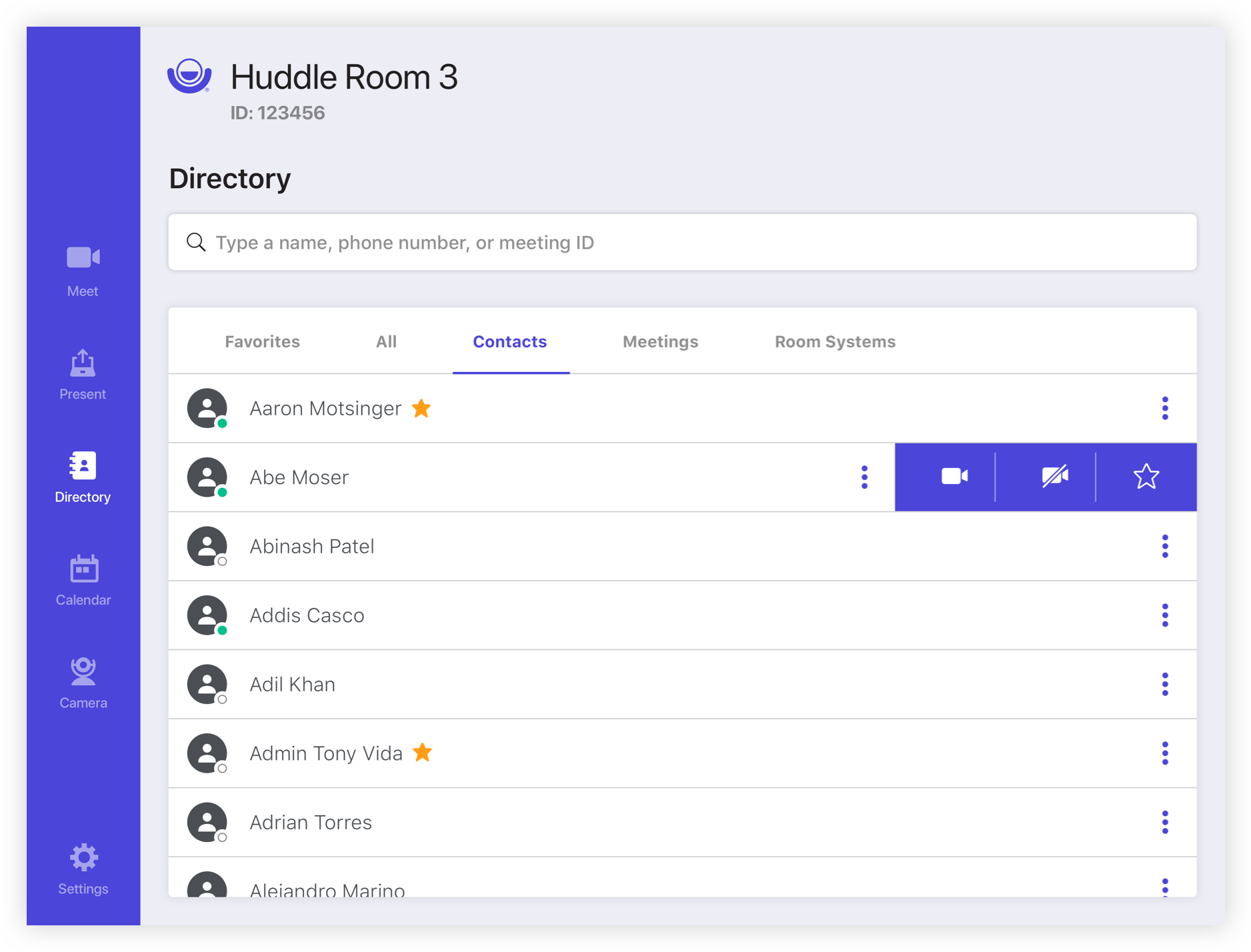
Have a quick list in the directory to show active meetings, recent calls, and favorites
Have a dial pad in the directory for people to dial numbers that way
Have the same camera settings in a call but also for the far-end camera
Have the ability to put in dial tones from within a call
Be able to change the layout of the call when presenting your screen
(video feeds only, presentation only, or both)
I made a list of all the needed features for while the user was either in a call or out of a call. I then grouped them into categories to help me know where to put them in the existing app or if I needed to add a new section.

In the first iteration of the wireframes, we wanted to try to keep the bottom navigation that we had in the Dash app. In the images below, we were trying to choose the best way to show the camera controls on the home screen and in-call. We wanted them to be prominent enough that the user knew they were there but not so prominent, it was all the user saw.


One of the most challenging parts of wireframing this project was getting everyone to agree on how to display the calendar on the home screen. It was a “too many cooks in the kitchen” scenario. Here were a few options that were presented:


Not too much changed from the Dash app in version 1. It was mostly the home screen, but you can see from the wires below that some of the changes were small but significantly improved the user experience.


The UI for version 1 was pretty simple: take the current app and update the UI to include the new features. Below you can see the Dash app home screen on the left and the new Room Controller App on the right.

Due to the nature of this project, I won’t go into a lot of details about the UX/UI of version 1. It will be discussed in more detail later.


After presenting this version to the executive team (probably for the 3rd time), they decided this was not the way to go at all. Instead of adding to the pre-existing app, we should build a new one. No limits! And so, we did. I re-designed the entire thing in about a week. I don’t think I slept the entire time, but I love a challenge.
With this new version, I wanted to try out a few things as well as get some internal testing done to validate/invalidate some of my decisions before I presented to the executive team again. In the same week that the app was being re-designed, I also spent 3 days doing moderated internal testing of my prototype. I tested about 10 people total. The results will be talked about further down.
I didn’t have time to do any wireframes with this round, so I jumped straight to UI and testing. A few important pieces of feedback from the exective team were:
We no longer like the purple background
“Home” should be “Call” and it should be very obvious that this screen is for starting a call
Show the agenda for the room for the next 48 hours, potentially on the home screen
The user shouldn’t have to look for anything. It should be very obvious where things are
This should also be able to work on a 7in tablet since we support it AND it must also work at this size because we may use it on the next generation of Phone HD


I did 3 days of internal user testing to help validate/invalidate some of my ideas. This was invaluable. Overall the testing went great, and I got a lot of good feedback. When I presented version 2 to the executive team, I also presented the results from testing. This helped to curb any “opinions” in the room and base feedback on quantitative data. Some of my findings are below:
Most testers clicked on the persistent Do Not Disturb button to turn it off but had to think before coming to the conclusion to go to settings to turn it back on.
To solve this, I made the DND button into a flag and used animation to bring it onto the screen. When a user taps on it, instead of toggling DND off, it re-directs the user to the settings page with the DND section in view and animating quickly to grab attention.
On the Call screen, the first thing that most users did was join the next upcoming meeting.
This was perfect and exactly what we were hoping for.
Though all of our testers were conditioned to see a contact card when tapping on a name in the directory, lots of them expected the system to start a call with the individual that was tapped on with some kind of confirmation step. They actually found it to be easier to use this way.
Again, this was exactly what we were hoping for!
On the camera screen, it wasn’t clear to users how to edit the name of the preset.
Oops! Sometimes you don’t think of everything. We fixed this by adding a long press to edit the preset.
To see an in-depth presentation that I created for the executive team at this step in the process, you can download it here.
Yep! The executive team wasn’t crazy abou the use of a floating box to contain everything. They felt it was a little too disconnected and also wouldn’t scale well to smaller screens. They also wanted to see a “lighter” version since the past 2 versions had leaned more to the darker side. So, we re-designed…again.
With version 3, I did exactly what the executive team asked for. Everything is now much lighter and much less purple. This also much more closely matches our mobile app.


Not much UX changed with the in-call experience between versions, but we did face some challenges with presentation due to how the room system handled it.
There were several options for how to present using the room system. The user could plug in an HDMI cable, present wirelessly, or present wirelessly to an attached Share device.
When using an HDMI cable, the presentation could either start automatically or manually depending on the settings.
At the time, the room system only had the functionality that something was plugged in to the HDMI, not what was plugged in. So if a user presented wirelessly to a share device and the system was not configured to start presenting automatically, nothing would happen. We needed a way to make this very obvious to the user, so there was no confusion.
The user is also able to pause and re-start the presentation manually from the RCA and from the Phone HD when presenting wired and wirelessly online, so this also needed be thought through.
You can see the solution in the flow below or see a bigger version here.
To see the Lifesize Room Controller App in production, check it out on the Lifesize website. It’s available for download on iOS and Android!

